DAZN is Europe’s largest digital live sports broadcaster, streaming rights from the NFL to Serie A. It has 20 million paid subscribers globally.
Seamless concurrency
The problem
DAZN had streaming limits in place: customers could only watch content on a certain number of devices simultaneously. The business rationale was straightforward: reducing account sharing would encourage upgrades. But the way it was being communicated wasn't working.
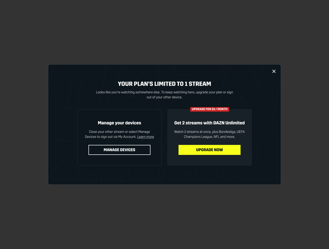
When customers hit the limit, they were met with something that felt like an error message. It was abrupt, unexplained, and with no clear path forward. They felt like they'd done something wrong, when in reality they just needed more context and a clear choice. The experience was eroding trust at one of the most frustrating moments a streaming customer can have: while watching a live sporting eent.
The hypothesis
If we reframed the concurrency experience from a restriction customers were running into, to a clear choice being offered to them, we could reduce confusion, improve trust and create a genuine upgrade opportunity without users feeling pressured.
My role
I wrote all content across the full concurrency flow, delivered for both DAZN consumers and DAZN Business, across web, mobile and TV.
What I changed and why
The existing language leaned on technical terminology (‘concurrent streaming’) that meant nothing to most users. I rewrote it in plain, human explanation: what's happening, why, and what users could do about it.
The tone shift was just as important as the words themselves. I rewrote it to increase clarity, and ensure it was informative, with options presented transparently. Upgrade was offered as an option, not an obligation, which meant customers who couldn't or didn't want to upgrade had clear options to keep watching.
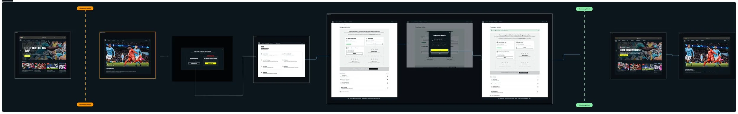
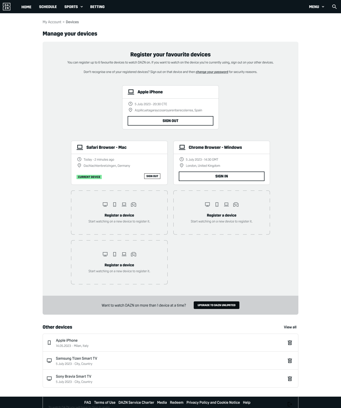
I worked across every touchpoint in the flow: the initial pop-up (which appeared after a 5-minute grace period), the streaming limit screen on TV, and the Manage Devices section in My Account, ensuring the language was consistent and the logic tracked clearly from one screen to the next.
Results
The redesign successfully shifted user behaviour, reducing unsanctioned concurrent streaming and driving meaningful upgrade conversion among users who had previously hit the limit and churned. The project was considered a commercial success internally and the approach was carried forward as the standard for how DAZN communicates account restrictions across its product.
DAZN CEO: “You guys have taken a very complex problem and presented it very easily – well done”
Visuals
Full flow
Individual screens
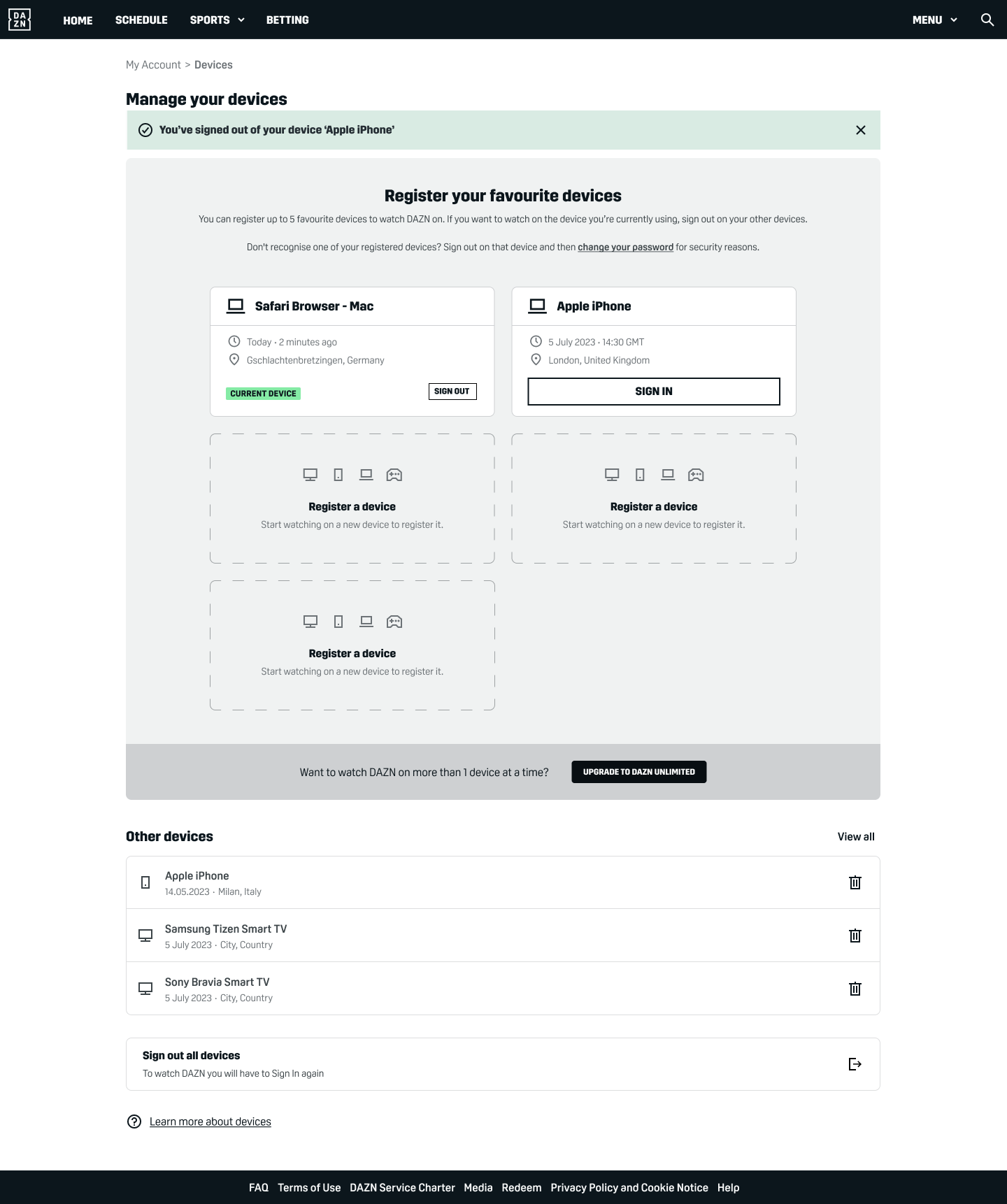
‘Manage your devices’ in My Account, with success message
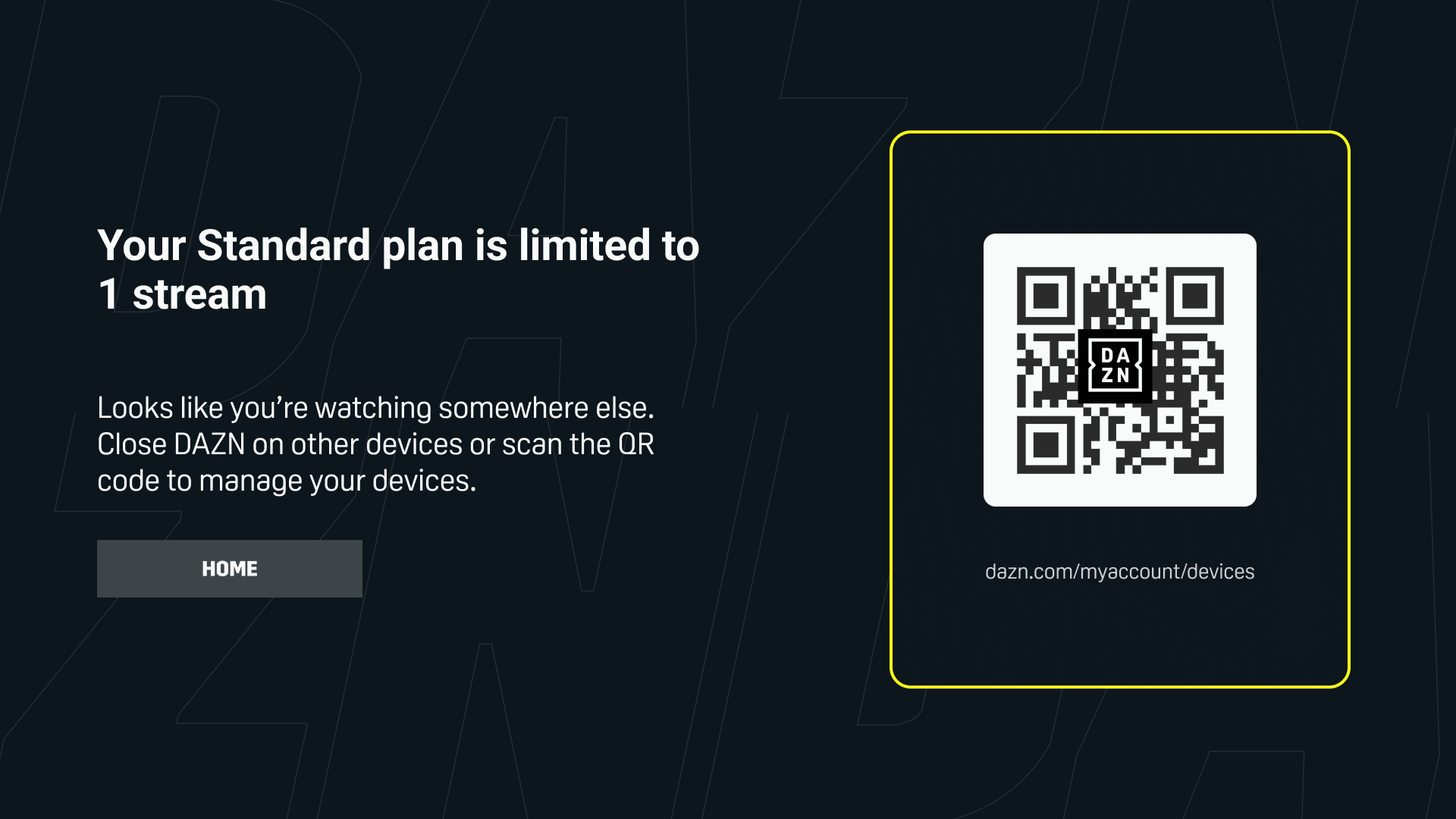
Pop-ups for TV
We also introduced a QR code for territories where there was only one option (close the other stream to keep watching), and upgrade was not possible.