Flo Health is the world’s #1 women’s health app. Over 420 million people around the world use the Flo app to track their periods, ovulation, pregnancy, and perimenopause.
Perimenopause mode
March-June 2026
Role: Senior Content Designer
The problem
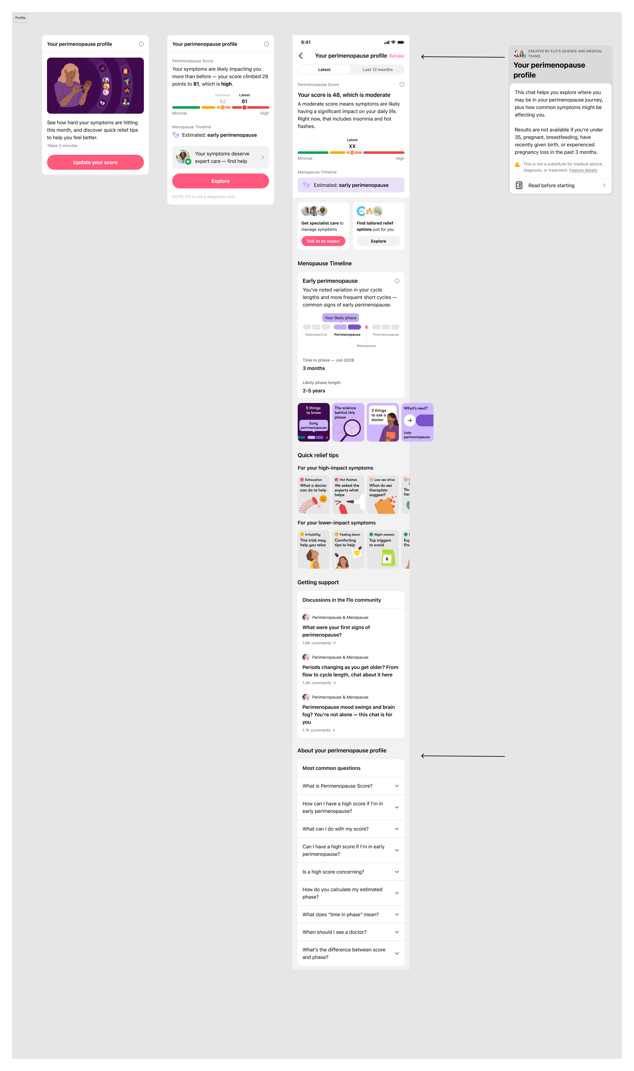
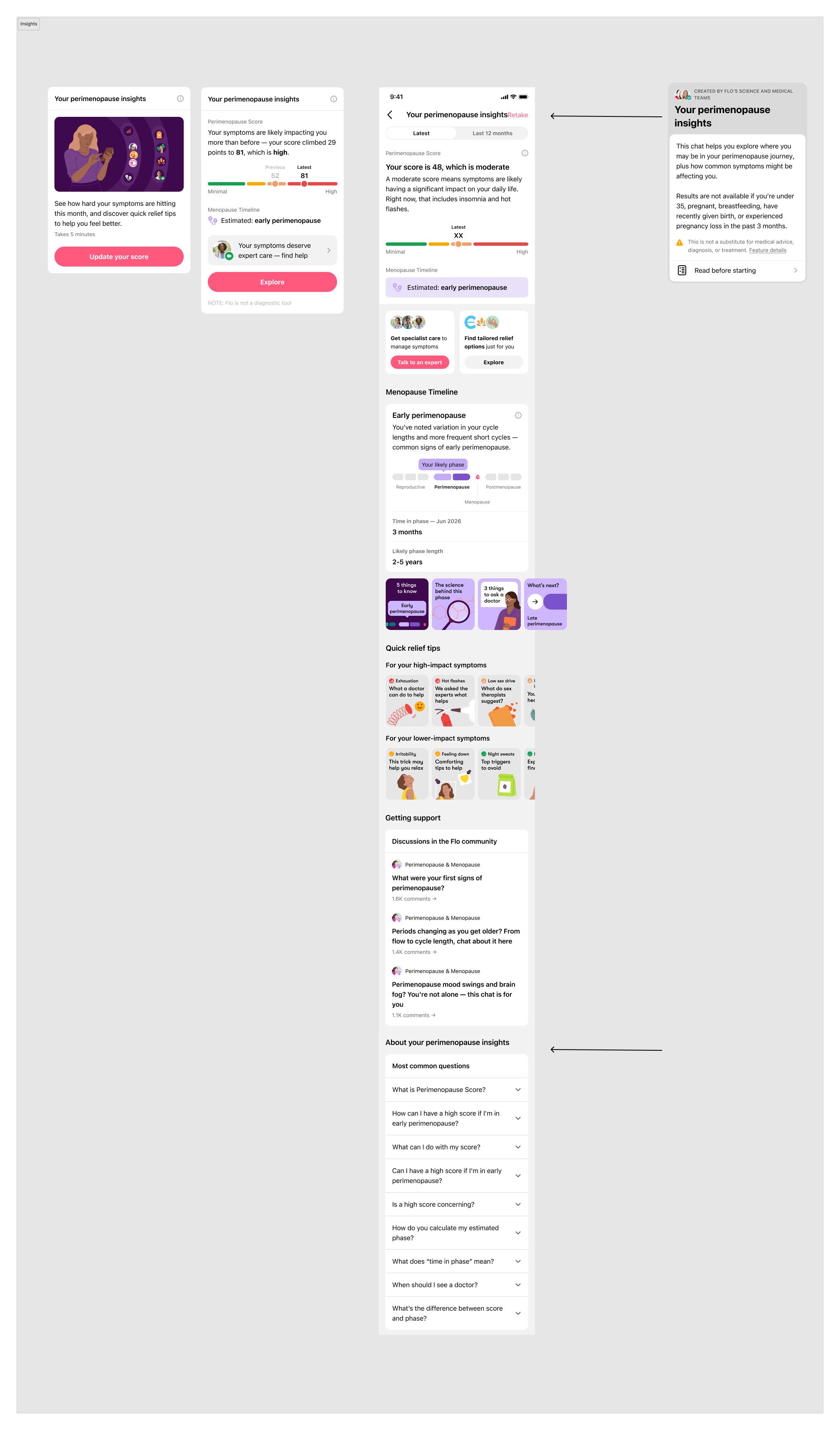
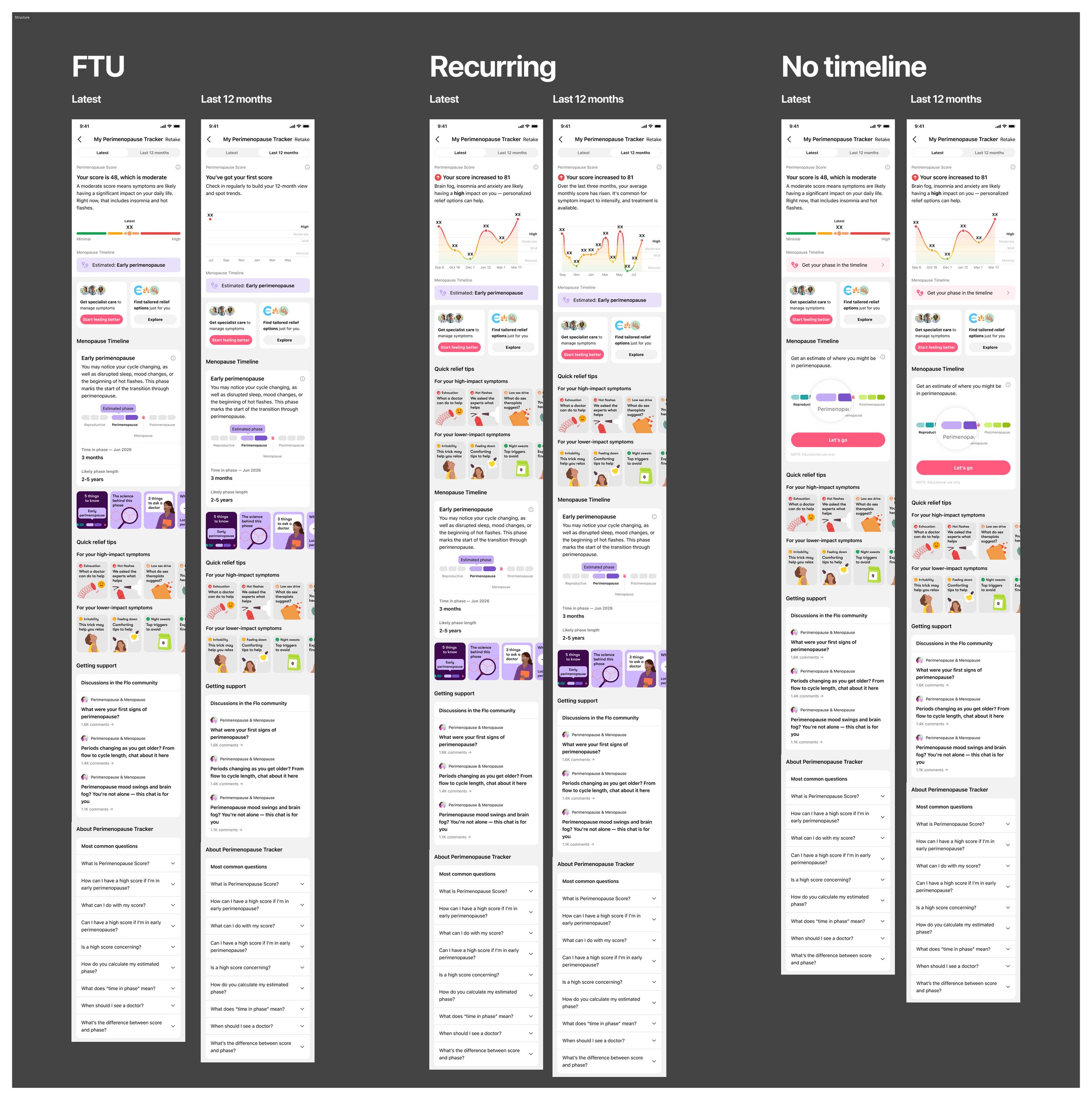
Flo's main goal for H1 2026 was to improve engagement and retention for perimenopause mode. Two new features, Perimenopause Score and Menopause Timeline had been released.
Score helped users track the severity of their perimenopause symptoms and offer relief options. Timeline helped users see where they were in the menopause ‘journey’.
However, these features weren’t weren't landing with new users. Research showed they felt “scared” receiving their first score, couldn't understand what it meant, and were cancelling because the main screen felt cluttered and overwhelming. There was also a specific misunderstanding to solve: users assumed a high symptom score meant they were in early perimenopause; a conflation between two distinct features.
The hypothesis
If we merge two features, Perimenopause Score and Menopause Timeline into one widget, assessment and result page, then we can increase starts/completes and engagement with the feature and post assessment engagement, leading to improved retention.
The solution
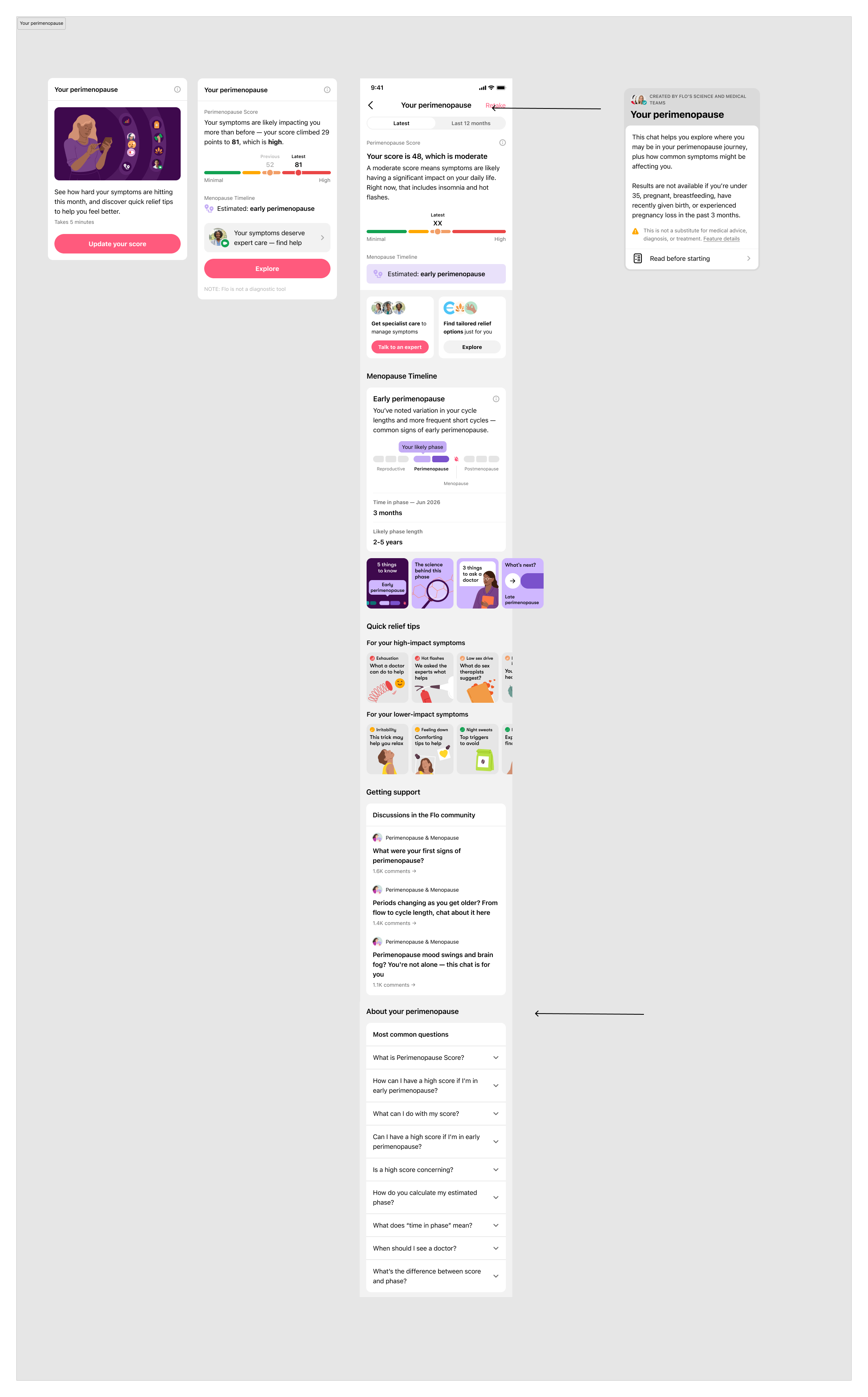
Create one clear, guided holistic perimenopause journey/profile that shows you where you are, what it means, and what to do next
Create tailored, relevant experiences for users around the core message 'Get clarity on perimenopause, with a plan to feel better.'
Help users feel supported in tone
Add a summary section to explain perimenopause score results
Increase the visibility of trends at the top of the page, to help users track patterns
My role
I owned the content strategy and UX writing across the full journey. My focus was on three things: making the score results feel clear and empowering rather than alarming, untangling the confusion between score and phase, and ensuring every step pointed users toward a next action.
The research
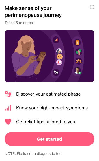
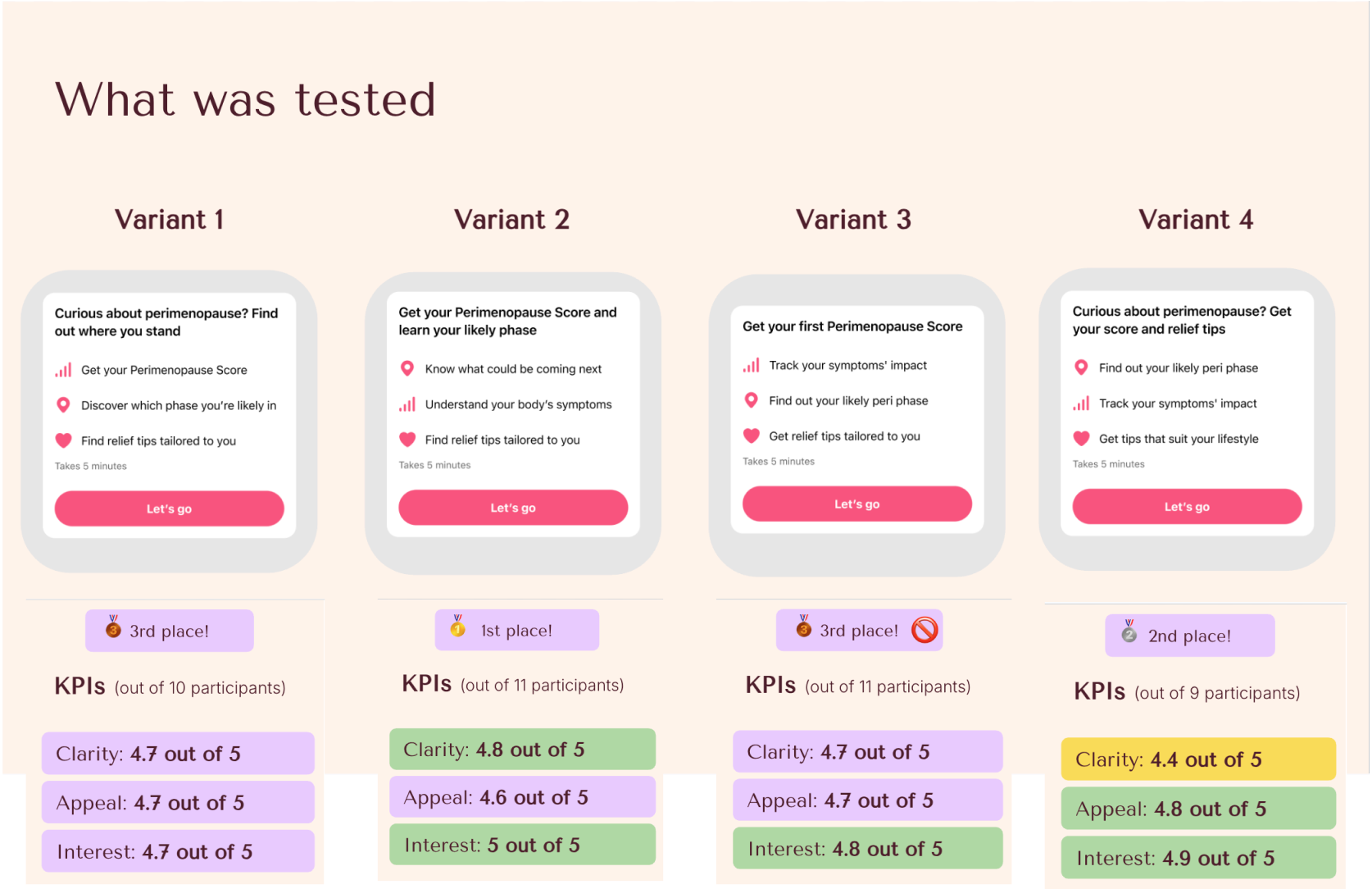
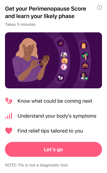
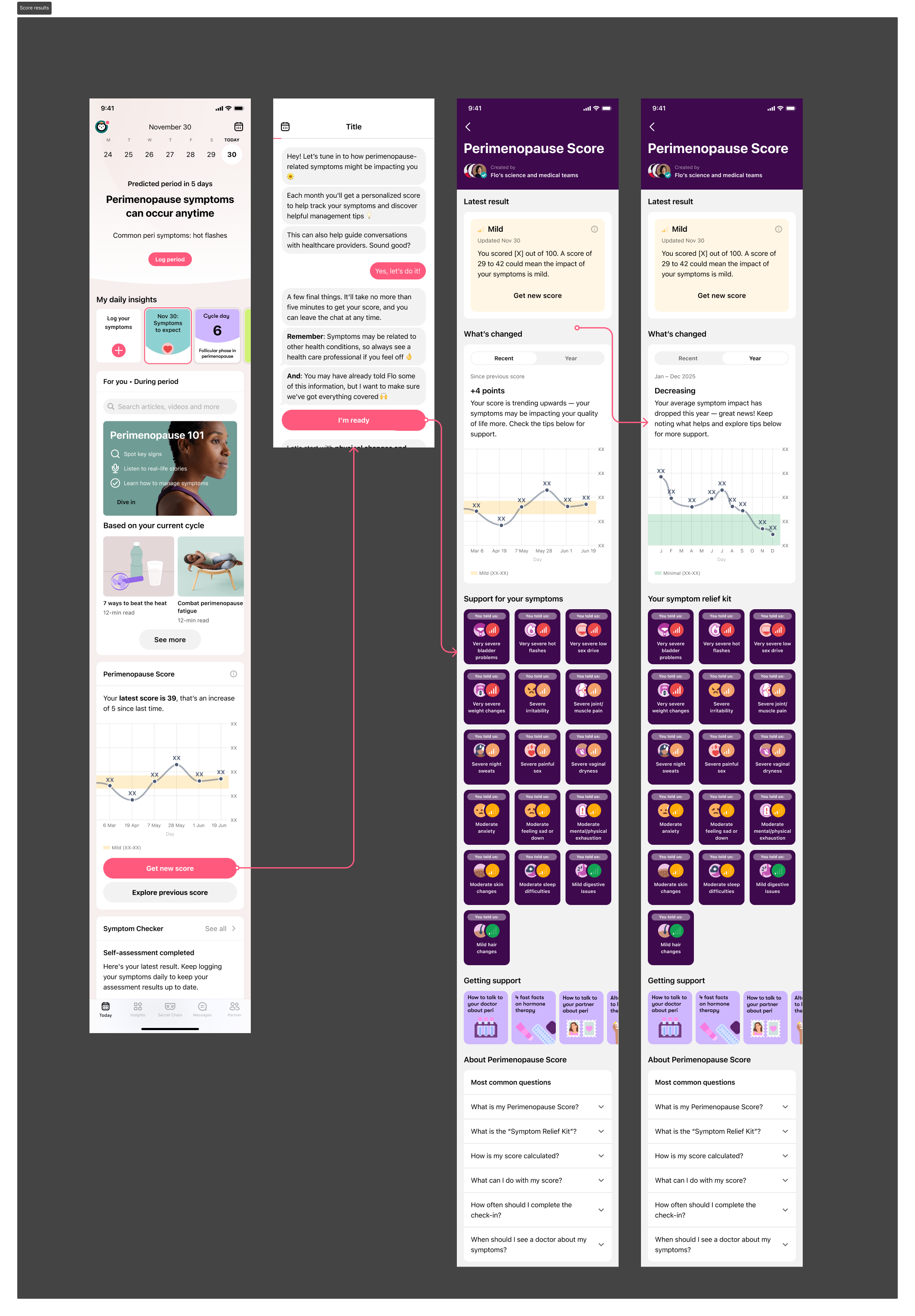
We tested a number of different hooks for the first-time user promotion widget. The existing content from the MVP designs positioned the feature as' ‘clarity on your perimenopause journey’ but didn’t mention the feature name (score).
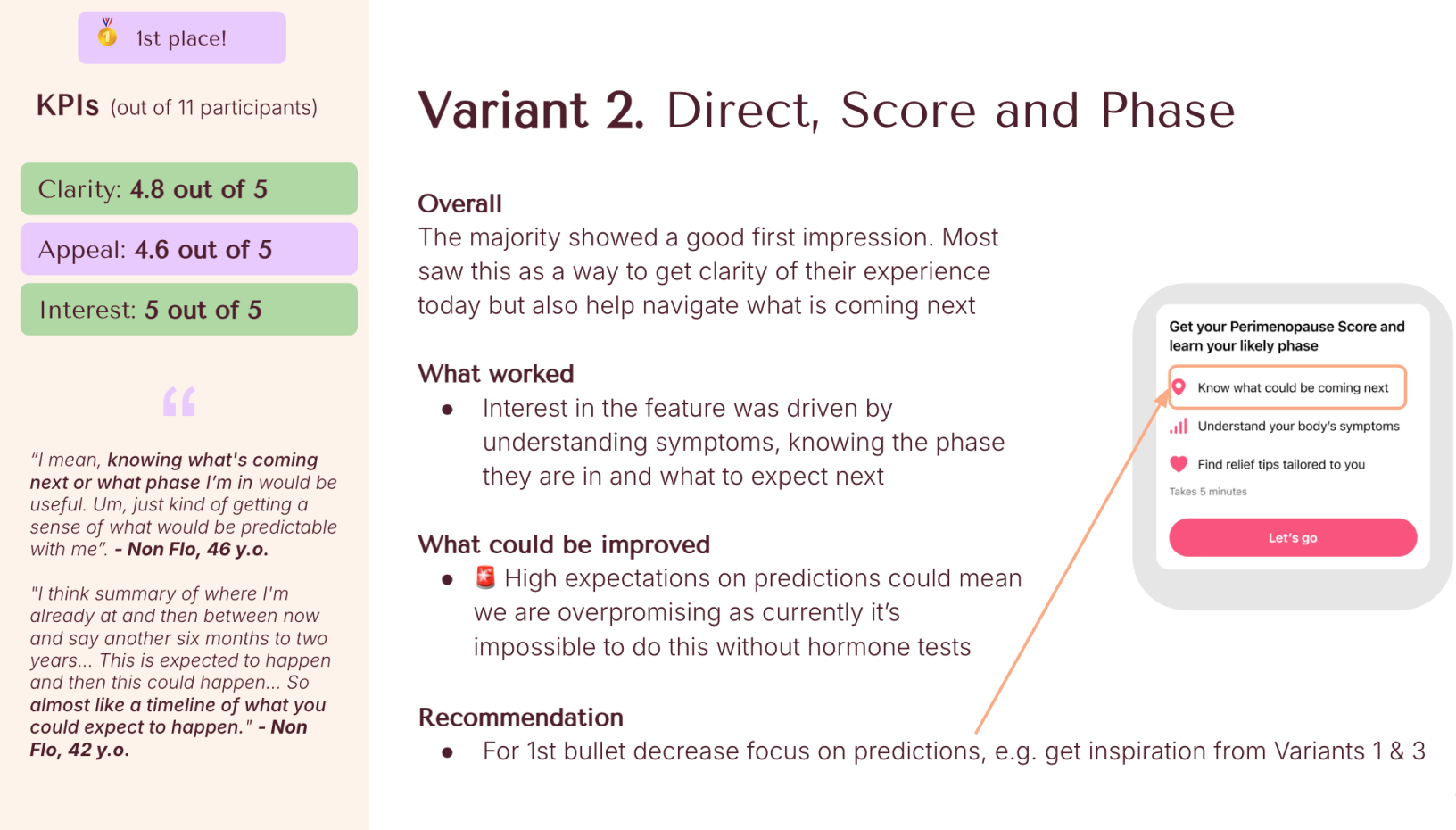
Together with a UX researcher and the product marketing manager, we ran UX research to iterate on the MVP, testing x4 alternative variants. Variant 2 performed the best.
Results
My Perimenopause Tracker performed well in testing and was favoured by compliance and legal teams, so was chosen as the feature for the name.
Summary of content changes
I added confidence and clarity, and increased the reassuring tone across the journey. I also simplified medical language to balance clinical accuracy with genuine readability — a particular challenge in a regulated health context.
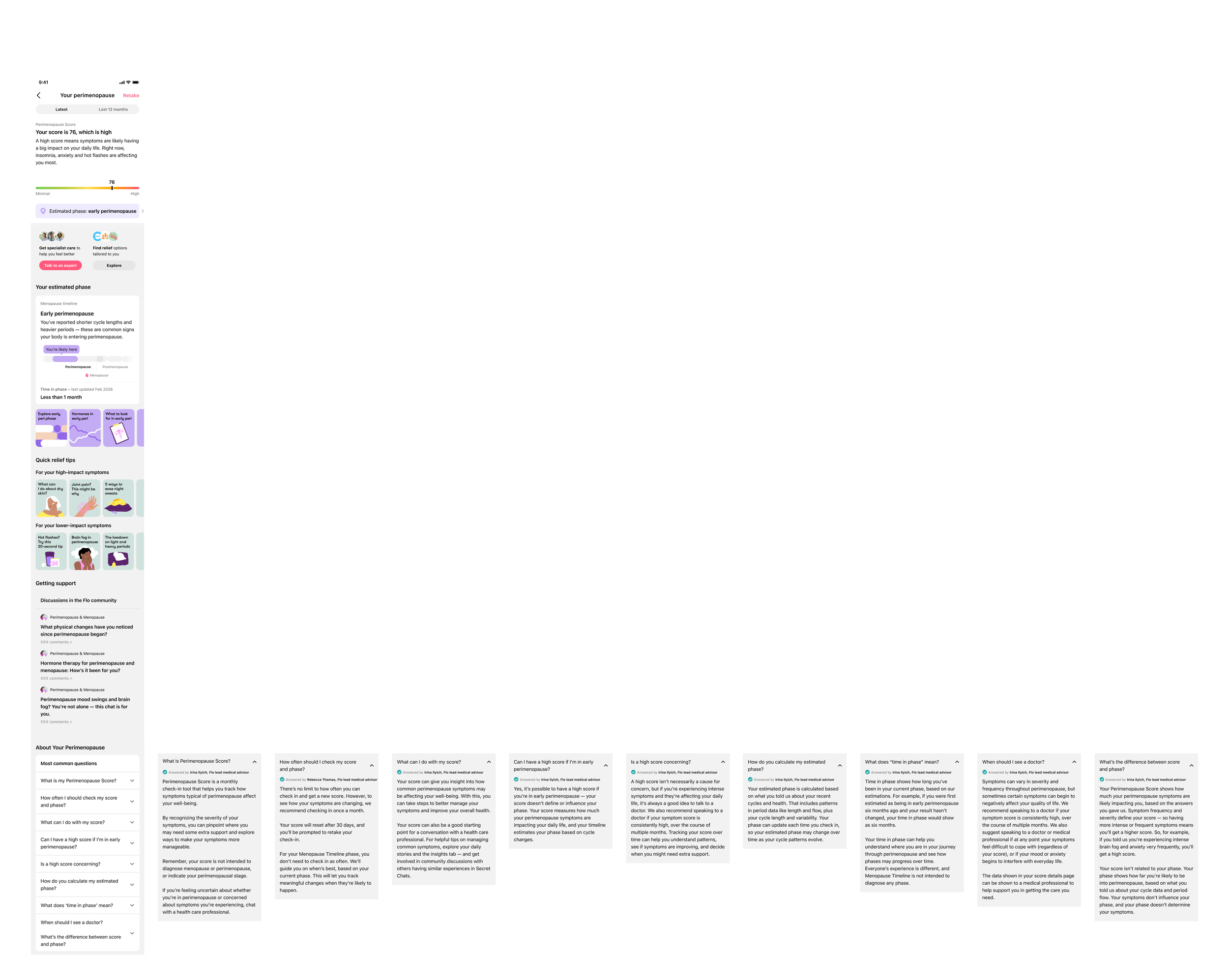
The original score result copy was not explanatory, and vague "a score of 29–42 could mean the impact of your symptoms is mild". This left users more uncertain, not less. I rewrote it to be direct and personalised: "A moderate score means symptoms are likely having a significant impact on your daily life — right now, that includes insomnia and hot flashes." This gave Flo's assessment conviction, and gave users confidence by playing back the symptoms they had noted in the score assessment.
I applied the same thinking across the timeline phase result
I created more engaging copy for the promo widget for the first-time user experience so it was more benefit-led and the banner beneath the score — shifting everything from descriptive to benefit-led and actionable.
I wrote a targeted FAQ set (visual below) to capture users’ most asked questions, using insights from CS teams, and to directly address the score/phase confusion before it arose.
Original designs and copy:
Existing visual (MVP)
Feature name testing
We also ran user testing on the name of the feature.
1.Your Perimenopause
2.Perimenopause profile
Pros:
- Instantly clear what it does
- Positions the feature as an ongoing companion that gives users a sense of agency
- Aligns with Flo's tracking identity
- Creates expectation to return and update, as it gets more useful the more they use it
Cons:
- Potentially less clear for those who aren't in perimenopause (eg late repro). More indirect options may work for broader audiences
Pros:
- Shortest for UI
- Visually clean (low cognitive load)
Cons:
- Can't use it as a feature name (eg refer to it as a feature in content eg 'Check 'Your perimenopause')
- Doesn't necessarily sound dynamic or imply a function
4.My Perimenopause Tracker
Pros:
- Positions the feature as a personal, evolving record of who you are in this stage of life
- Familiar concept
- Feels personal and comprehensive
- Invites exploration
Cons:
- Low risk overlap with 'profile' in community
3.Perimenopause insights
Pros:
- Feel smart and valuable
- "Insights" signals analysis, not just raw data
Cons:
- Slightly less clear than tracker/profile
- Requires interpretation of what "insights" means
- Could sound like static content
This was the new journey after the merger. Copy was sharper, more detailed, and more confident, building reassurance for the user.
First-time user experience
FAQs
Menopause timeline copy variants
I also created personalised copy variants for the menopause timeline, working closely with engineering teams to use data about cycle length and flow to inform the personalisation.
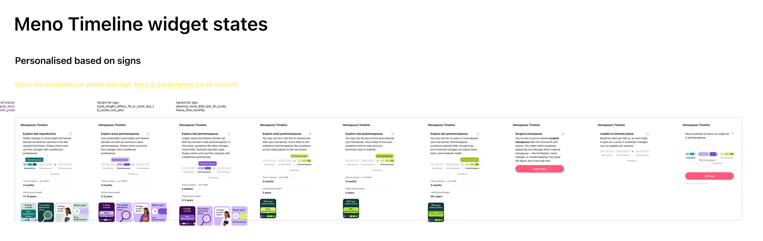
A snapshot of the logic I wrote for each variant (there were 30+ states in total):

I also created pop-up messages and chatbot content that linked to Perimenopause Score and perimenopause relief options, another related feature for users with perimenopause symptoms.
