DAZN is Europe’s largest digital live sports broadcaster, streaming rights from the NFL to Serie A. It has 20 million paid subscribers globally.
Ad blocker deactivation
The problem
A significant portion of DAZN's users were watching content with ad blockers active, which eroded ad revenue for the business. We needed a way to encourage deactivation, but the content challenge was a difficult one: there was no direct benefit to the user. We were asking people to do something very inconvenient, for the business’ immediate benefit, in as small a space as a pop-up banner.
On top of that, we had to explain what an ad blocker does and how to switch it off, in a few lines of copy, without being technical, patronising or annoying.
The hypothesis
If we could find the right angle (transparent, benefit-framed copy that respected users' intelligence) we could achieve meaningful conversion without damaging trust.
My role
UX writer on a small cross-functional team alongside a UX researcher, product manager and two product designers.
What I worked on
The team decided to show a pop-up banner both while users were browsing and while they were actively watching — the moment the ad blocker was actually having an impact. The banner needed to work in a tiny amount of space, which meant every word had to earn its place.
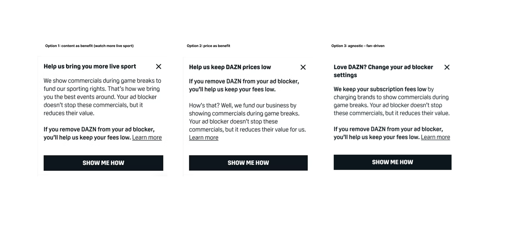
I wrote three distinct variants, each built around a different persuasion angle:
Content-led — Watch more sport. Leading with what the user loves about DAZN and framing deactivation as protecting that.
Price-led — Help keep prices lower. Transparency about the commercial reality, appealing to users who care about value.
Fan-driven — If you love DAZN, do this. A direct appeal to loyalty and identity.
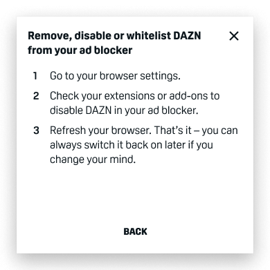
Alongside the persuasive copy, I also wrote a second frame within the pop-up that walked users through how to actually disable their ad blocker — removing the need to click through to a help page for the majority of users, and reducing the friction between intent and action. A full help page was available for anyone who needed more detail.
The results
15%+
conversion rate across all variants. Content-led and price-led performed best.
£1m. +
Total revenue generated
Jan 2021
Role: UX Writer
Visuals
The three options tested
Options 1 and 2 performed the best, with 3 also performing well – we used a combination of these.
Second screen after ‘show me how’
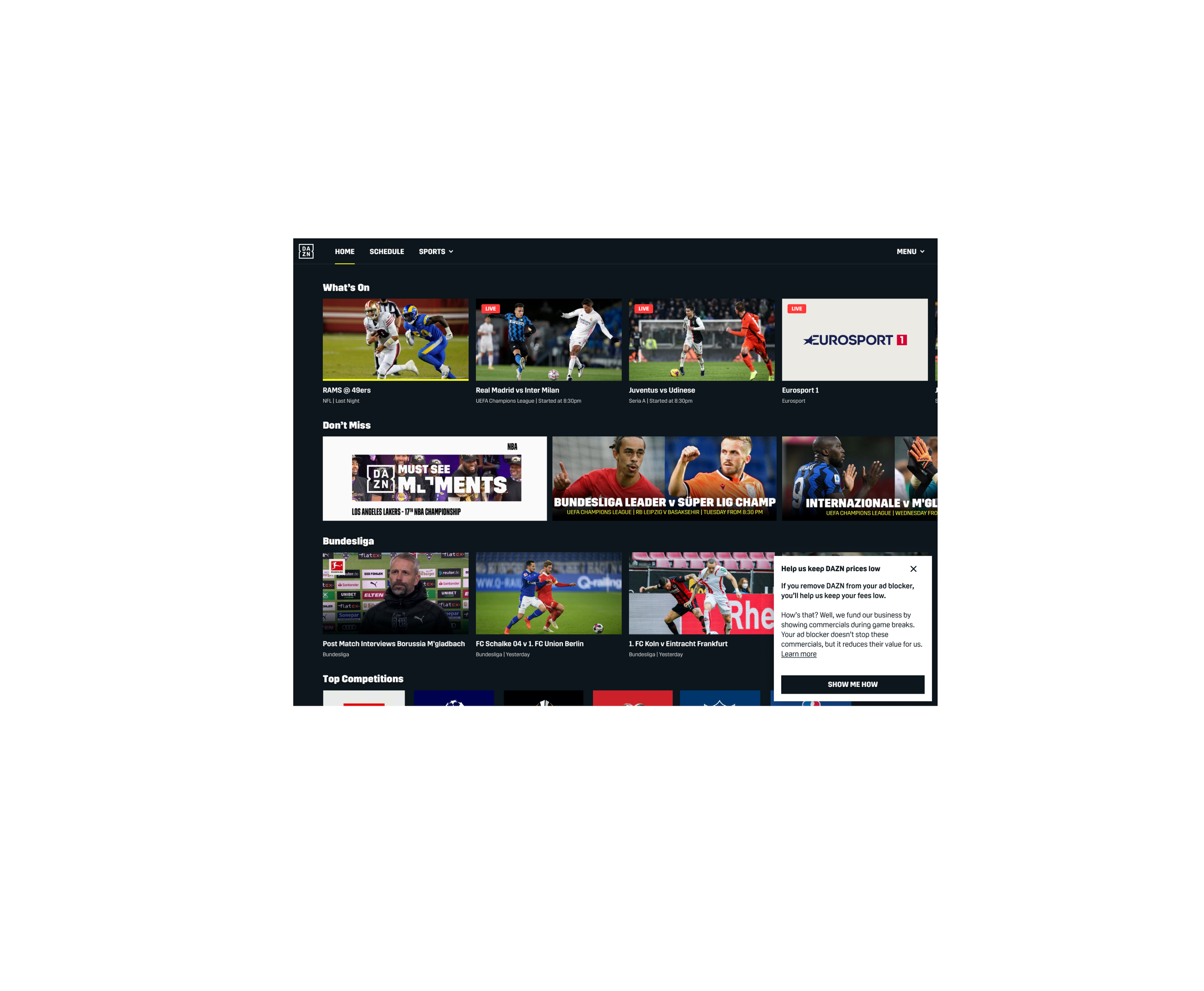
In-situ (pops up on the home screen)
Help article
