DAZN is Europe’s largest digital live sports broadcaster, streaming rights from the NFL to Serie A. It has 20 million paid subscribers globally.
My Account – cancellation journey
Q1 2023
Role: Lead UX Writer
The problem
DAZN’s high churn rates posed a serious risk to its subscription model. The cancellation flow became a top priority, with the goal of retaining users while maintaining transparency and trust.
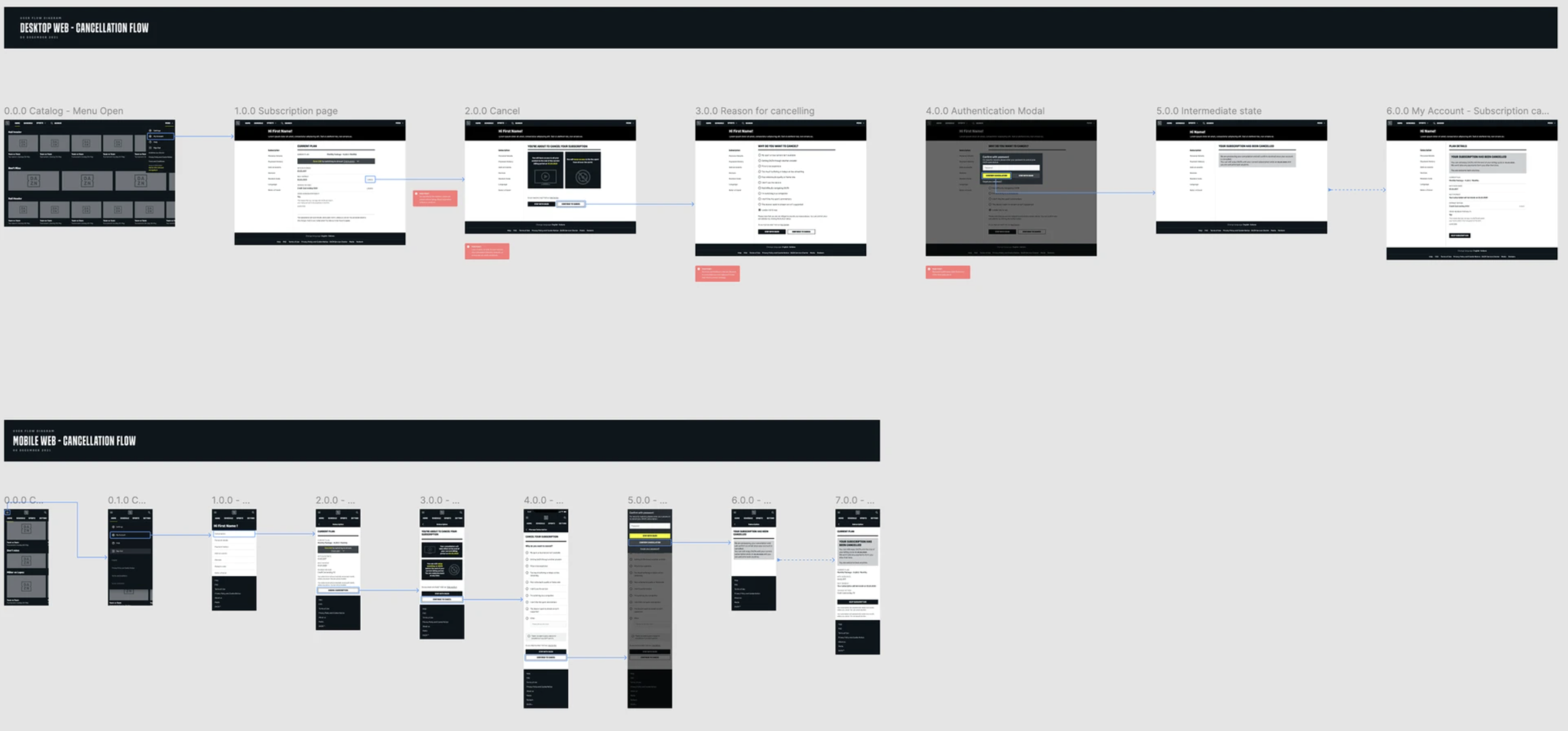
The existing cancellation journey (below) lacked structure and visibility. There was no data on why users were leaving and no tools to address churn effectively. For the business, this meant limited understanding of cancellation behaviour and no way to act on it, resulting in missed opportunities to retain users.
The research
Through interviews, we uncovered two main frustrations: the seasonality of sports content and the friction caused by unnecessary steps in the cancellation flow.
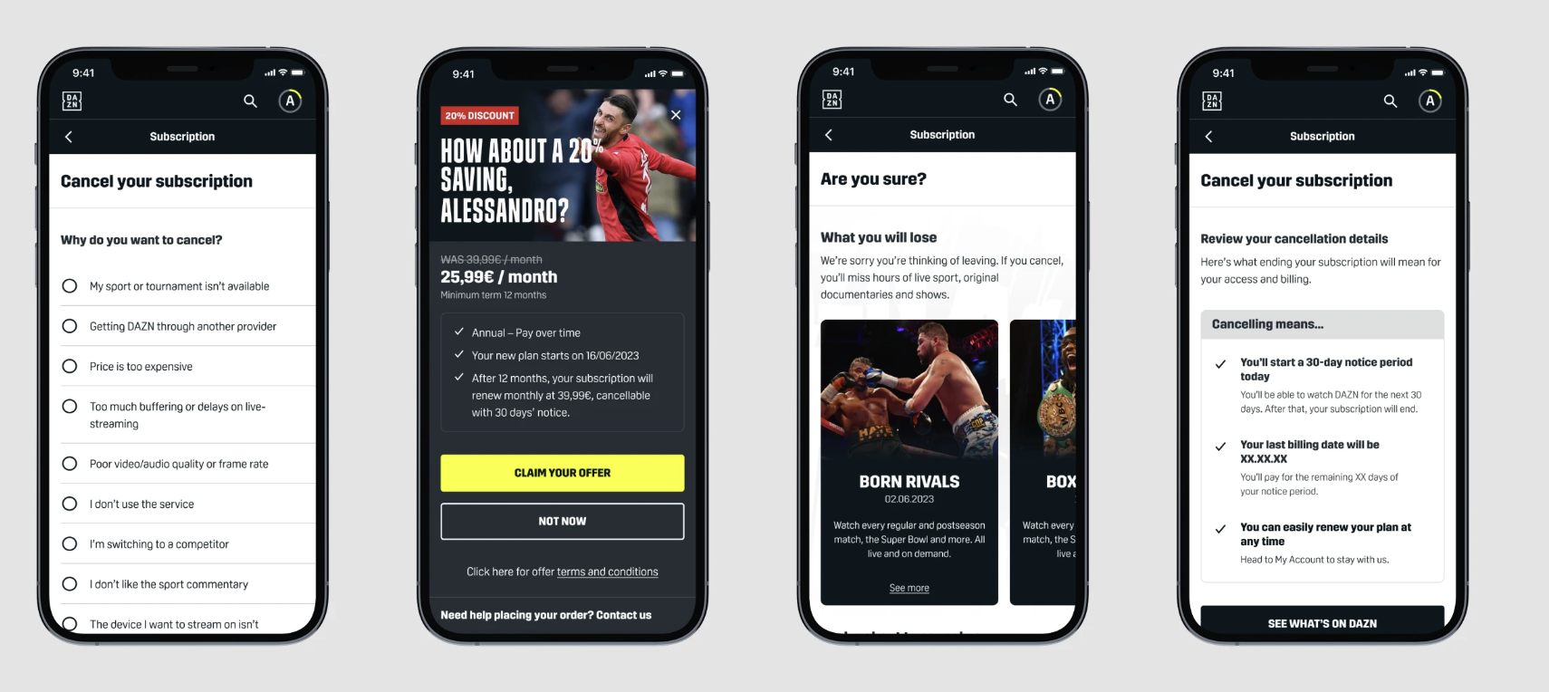
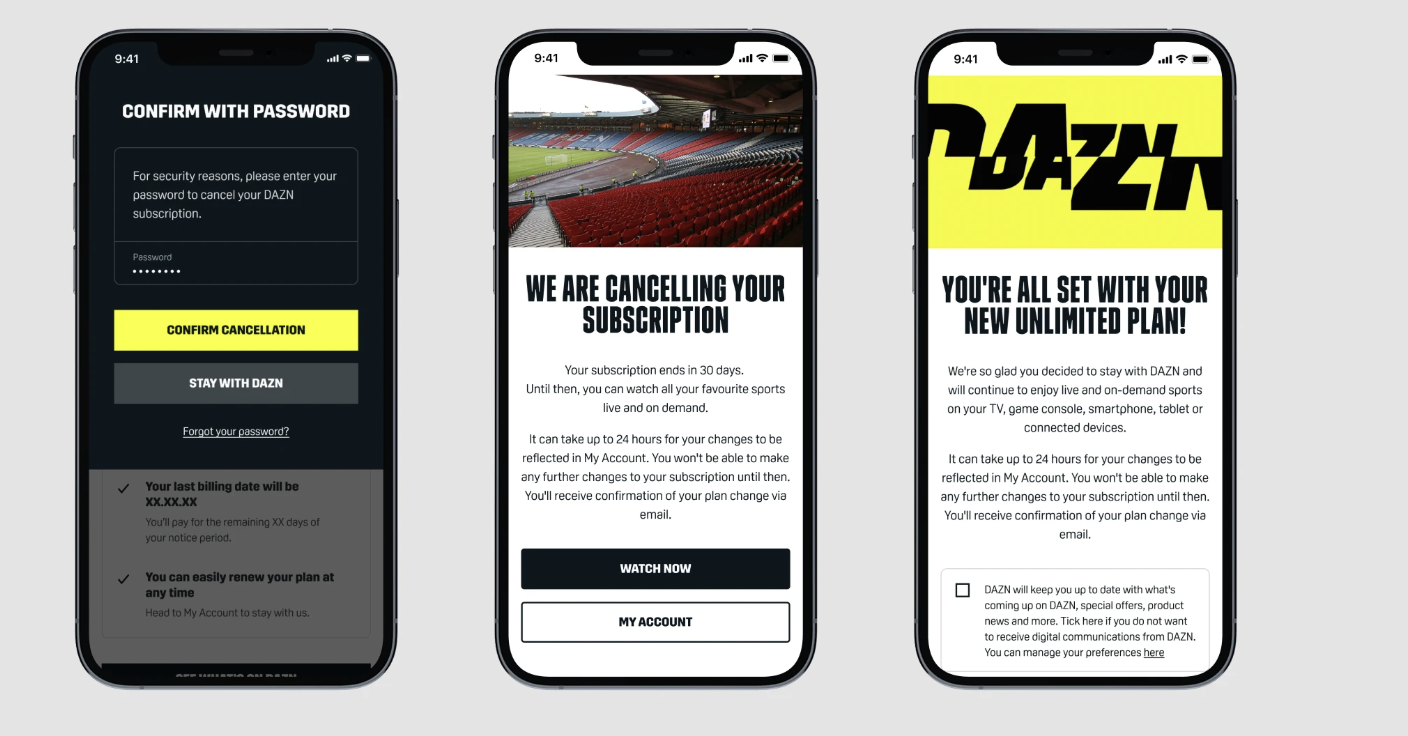
Many users said they only subscribed during the football season and felt unsure about their options when taking a break. Others were frustrated by having to re-enter their password to confirm cancellation, describing it as redundant and inconvenient. Overall, they wanted clearer choices and a more seamless experience when managing their subscription.
💬 “I usually stop watching after football season. I just want an easy way to pause.”
💬 “Why do I need to re-enter my password just to leave?”
Benchmarking revealed that leading services used multi-step journeys to encourage reflection, clarify what users lose when leaving, and present personalised alternatives such as discounts or the option to pause.
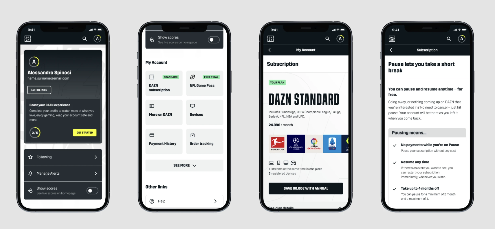
The content design challenge
Within tight constraints, we explored ways to make the flow clearer, more flexible, and trustworthy.
Pause integration: This feature already existed but was often misunderstood. Together with a product designer, we repositioned it earlier in the journey and clarified its purpose as a temporary break, making it a clear alternative to cancellation.
Reason-based flow: Depending on the reason selected, users were shown relevant discount offers designed to address their specific motivation for leaving.
Transparency: Each step explained what users would lose before confirming, helping them make confident, informed decisions.
Validating the flow
We tested two versions of the cancellation experience: one with contextual offers and one without. The goal was to see if a more supportive tone and personalised options could improve perception and retention.
The version with contextual offers performed better. Users described it as clearer and more human, with 4 out of 10 participants saying they would reconsider cancelling when shown relevant offers or the option to pause.
💬 “This feels more human. I understand what I’m losing, but it doesn’t feel pushy.”
Prototype
The results
1 Improved user understanding and confidence throughout the cancellation journey.
2 The pause option became more visible and actionable, directly addressing a key customer need.
3 Local markets adopted bespoke variants of the flow.
4 Delivered early indicators of higher retention and improved user satisfaction.
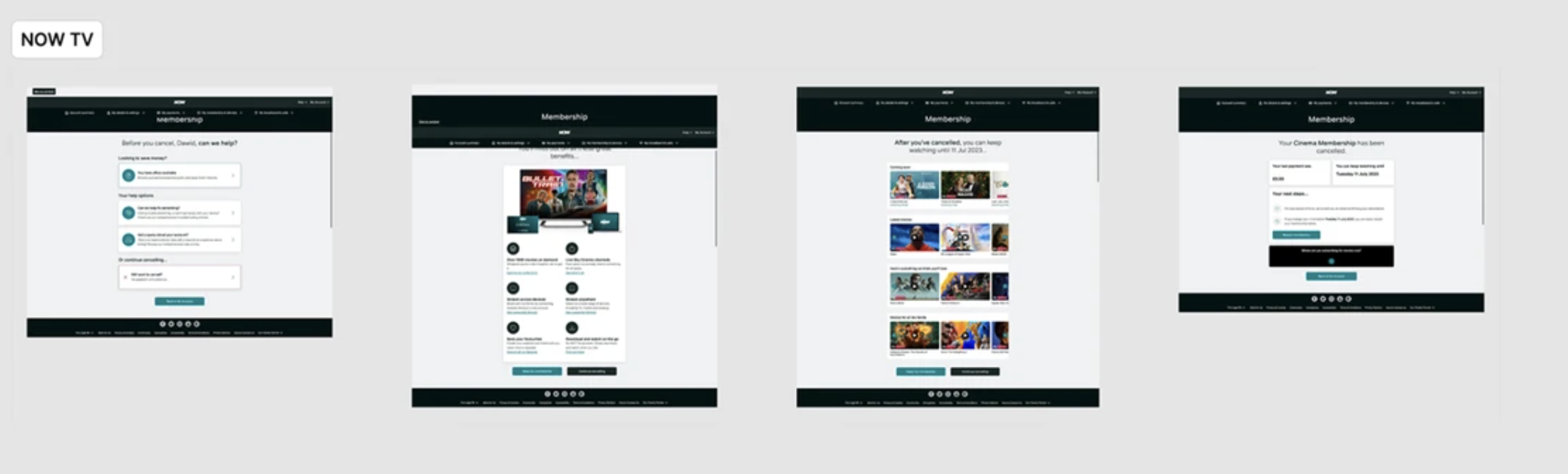
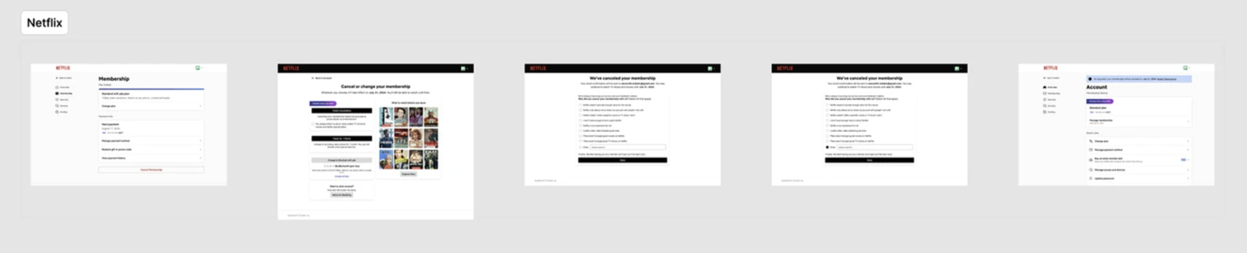
The visuals